ShopDreamUp AI ArtDreamUp
Deviation Actions


Suggested Deviants


Suggested Collections


You Might Like…


Description
Part of a class assignment.
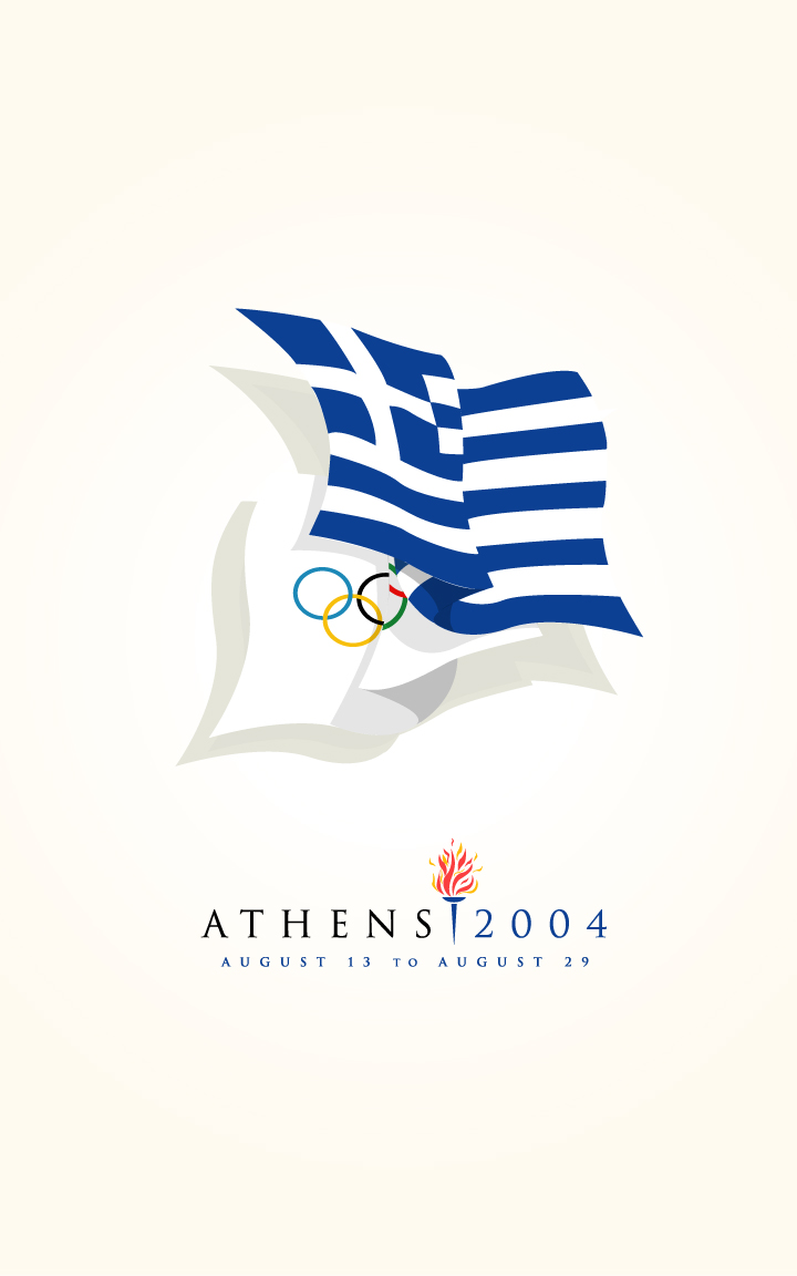
Sometimes the simplest answer can be the best.
Final Print: 11" x 17"
Yet Another Update: I apologize for updating this so much, but there are little nitpicky details that keep getting worked out.
First off, the olympic logo I had at the bottom had been removed. It was redundant and unecessary.
I also modified the shadows to be more "shadowy" rather than flat grey shapes.
Then, I changed the light cyan gradient to a 5% Yellow and 2% Magenta gradient. After all, these are the SUMMER olympic, so it needs to feel warmer.
Image size
720x1152px 115.32 KB
© 2004 - 2024 TheRyanFord
Comments81
Join the community to add your comment. Already a deviant? Log In
simply excellent.... i love it so much