ShopDreamUp AI ArtDreamUp
Deviation Actions
Suggested Deviants
Suggested Collections
You Might Like…
Featured in Groups
Description
Update: Site is live at avbhomes.com!
Second Update: Site won Site of the Day at CSS Awards.
I apologize for the file size. I had a lot of pages to fit in and wanted them all adequately represented. Please full-view to see the proper details.
Client Details
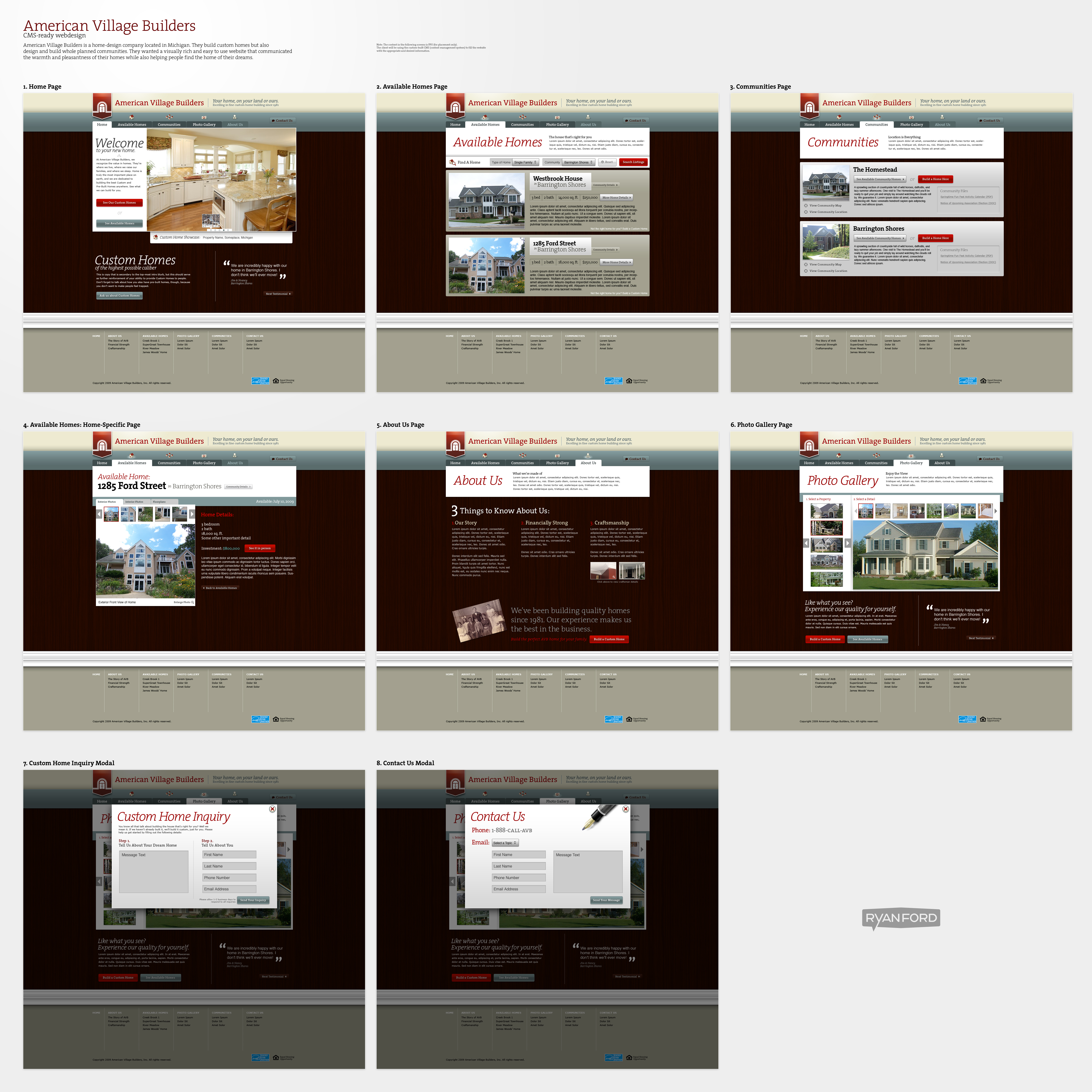
American Village Builders is an awesome home design company (architecture) based out of Michigan, and they contacted myself and my friends at YDEK Productions about building a new website for them.
Their primary interest in their site was portraying themselves as they actually were: a warm, friendly company who builds warm, welcoming homes. They wanted their website to have a lot of texture and detail, and so I obliged.
Process
Since I have a full-time job during the day here at dA, I worked on this after hours and on the weekends. AVB was very patient and I think the timeline paid off big time. There was quite a bit of back and forth between myself and the company, and that helped ensure they got exactly what they wanted.
The logo at the top of the page is theirs. I didn't design it. I was only able to modify their typography to fit with the design and place their mark into a more interesting "flag" shape.
Worth Note
All the photos and copy in this design are FPO (for placement only). The client will be filling in the content using the custom-built CMS that YDEK Productions is building for them. The site should be officially launched some time in the coming months.
Image size
5112x5112px 8.44 MB
© 2009 - 2024 TheRyanFord
Comments52
Join the community to add your comment. Already a deviant? Log In
I love the colour scheme; it's like a homelier version of red white and blue. Really evokes the feeling of a comfortable, solid and welcoming house. It took me a while to notice that the background is a wall though.
The icons along the top work really well too. It's a shame they're not used more throughout the site. For instance, why does the 'Community details' button next to a property not use the community icon (or a variation of) that's already established above.
On the contact form, and the Custom Home Inquiry form, I think you've missed an oppourtunity to make a connection with an important visitor (one who makes the effort to contact the site owners):
'Tell us about your ideal home' + 'Tell us about you' is simple, inviting and makes me want to respond, but the rest of the copy doesn't support this because it's too long winded and formal. The title 'Custom Home Inquiry' could be more personal.
Don't really know why, but the pen on the contact form doesn't seem right. I'm not writing, I'm typing. Something to do with homes or AVB staff could go there.
Why is the 'Contact Us' button seperated from the tabs next to it? Its position and low contrast might make some people completely miss it.
You've used two different reds, one for the logo and one for buttons, and they clash imho.
On the About Us page, the hierachy seems mixed up because the "We've been building quality homes..." text is larger than the 3 points above, so 3 points just fade out of existance. Maybe they'll stand out when the lorem ipsum is replaced, but I think a sub-title or icon for each one would help too. Also, shouldn't the photos have a realistic frame/border considering they're on a wall?
I also noticed that the About Us tab is faded on some pages, but not on others for some reason. I think both look fine, although I don't know why it's faded.
Overall, the site has great impact at first glance and looks easy to understand and navigate. It looks traditional, exciting and modern, which is a terrific mix to have achieved. That impact might be lost as visitors go further into the site though.
Hehe, Ford Street <img src="e.deviantart.net/emoticons/s/s…" width="15" height="15" alt="


