ShopDreamUp AI ArtDreamUp
Deviation Actions


Suggested Deviants


Suggested Collections


You Might Like…


Featured in Groups


Description
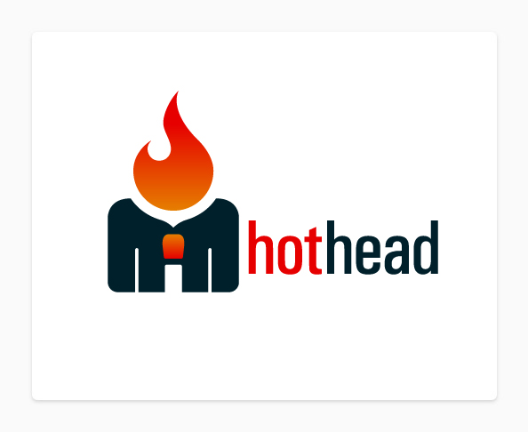
Logo concept for an advertising project that went unused.
Integration is of a standard symbolic human figure (wearing a tie) and a match with a flame.
(Made some edits to reflect suggestions).
Integration is of a standard symbolic human figure (wearing a tie) and a match with a flame.
(Made some edits to reflect suggestions).
Image size
594x486px 36.13 KB
© 2010 - 2024 TheRyanFord
Comments42
Join the community to add your comment. Already a deviant? Log In
Allow me to begin by pointing out that the overall use and positioning of shapes here is quite nice. I like how you've combined three concepts into one: the match and the flame, the man with a tie, and the shape of an 'H' (from 'hothead') coming from the man's body.
Having said that, some of the spaces between the shapes could use some adjusting. For example, the room you've left between the man's neck and the tip of the match is almost invisible compared to the sizing of the rest of the logo. Because the tip of the match is not connected to the rest of it, I'd suggest at least lessening that space by 10-20%, because it seems unnecessarily large (seeing as there's no need for your eye to be drawn there). With those changes, you might also make that 'H' (from 'hothead') more visible. I do however, like how you've positioned and sized the flame.
I'm tempted to point out that the colors could use some change. Although the reds you used (on the tip of the match and on the flame) are quite nice, the single hue of navy blue (pun intended) is a tad bit too dark and unappealing. Perhaps a more vivid, but still dark, blue would have worked better.
And as for the font you used, I'm unsure about what to say. I don't like rounded fonts per sé (Comic Sans totally ruined most of them for me), but I see how they might work well here. I also can't think of a much better alternative, except maybe something more along the lines of Fertigo Pro. Additionally, the text itself could be closer to the image itself, because when you look at the image (that's what your eyes are attracted to, first thing), you have to almost intentionally look downwards to read the text. It would be nicer to be able to analyze both at the same time.
In summary, the concept is amazing and the final output is stunning. This is one hot (extremely bad pun intended) logo!