ShopDreamUp AI ArtDreamUp
Deviation Actions


Suggested Deviants


Suggested Collections


You Might Like…


Description
Old work from 2006.
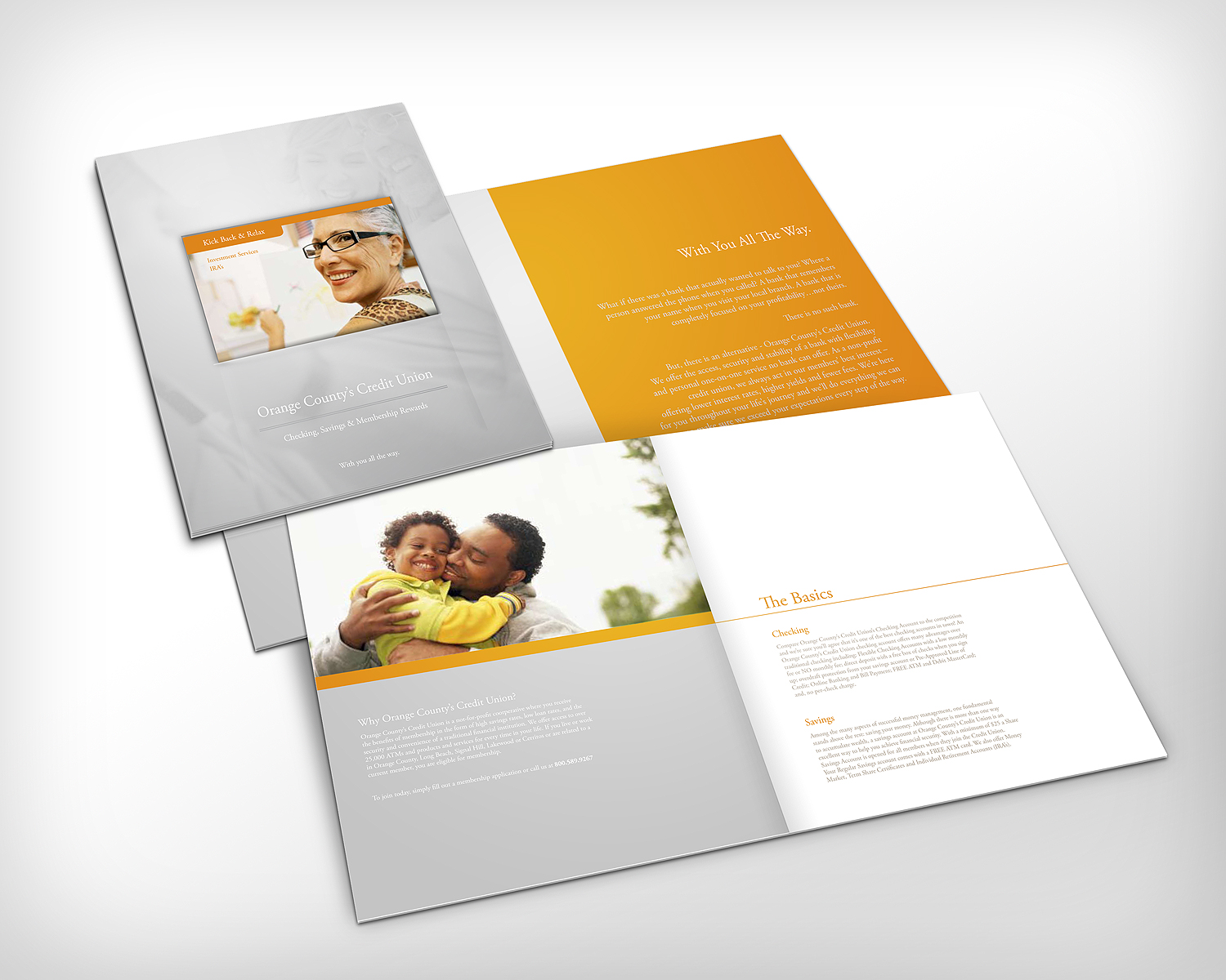
As part of our rebranding work for Orange County's Credit Union, we designed this brochure. As you can see, the brand colors are orange and silver (and much of the silvery color you see in this mockup would actually be a metallic ink).
The top-left page is actually the cover with a mini-brochure tucked into it. The idea was that this larger brochure was kind of a "generic" one that covered the whole bank, and then if you sat down with a rep he'd grab a mini-brochure that talked about the specific offerings the bank could make for you (eg, if you were a senior citizen they'd talk about senior's accounts, retirement, etc etc).
This is a collaboration with the talented Jason Simon.
Image size
1500x1200px 616.22 KB
© 2010 - 2024 TheRyanFord
Comments6
Join the community to add your comment. Already a deviant? Log In
Wow! Tht really nice and clean lve you vhoice of gray to go with the orange and the fact that your paragraphs aren't justified on both sides.